In this tutorial, we'll get to know the Extrude Tool and manipulate shapes in a 3-D format. We'll learn how to apply gradients to each section, use the tool's features, and use the Interactive Fill Tool and the Drop Shadow Tool in conjunction with the Extrude Tool in order to create rendered designs with a sense of depth.
1. Using the Extrude ToolStep 1Let's start with simple, flat shapes. I used the
Text Tool (F8) with the font
Lot to write out "A", "B", and "C". Make sure you've hit
Convert to Curves (Control-Q) in the
Property Bar so your letters become objects you can easily manipulate.
If you wrote out your letters in one line, you can
right-click on them after converting to curves and hit
Break Curve Apart.
Change each object's colors in the
Object Properties docker. I chose magenta, yellow, and cyan for my fill colors.
Step 2We're going to focus most of this quick tutorial on the triangle, or the letter "A". Select your shape and use the
Extrude Tool, found in the
Toolbox under the
Blend Tool, to drag your shape out to the left to create a 3D object. You can adjust your shape with the tool itself, or adjust its settings individually in the
Property Bar.
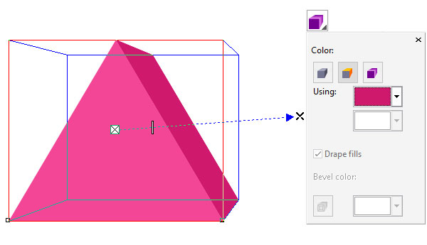
Step 3Once satisfied with your object's new shape, with the
Extrude Tool still in use, select the
Extrusion Color option in the
Property Bar. From here you can determine what color each extruded plane will be.
2. Rendering the Extruded ShapeStep 1The third option of
Extrusion Color is a gradient option, allowing you to choose which two colors will appear in your
Linear Gradient on the extruded plane. I chose magenta and dark magenta.
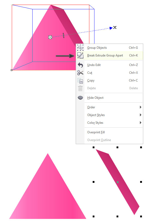
Step 2For greater rendering control,
right-click the
extruded object and hit
Break Extrude Group Apart (Control-K). This will allow you to apply various properties to each component of the extruded object. In the case of this triangle, it was broken apart into two objects.
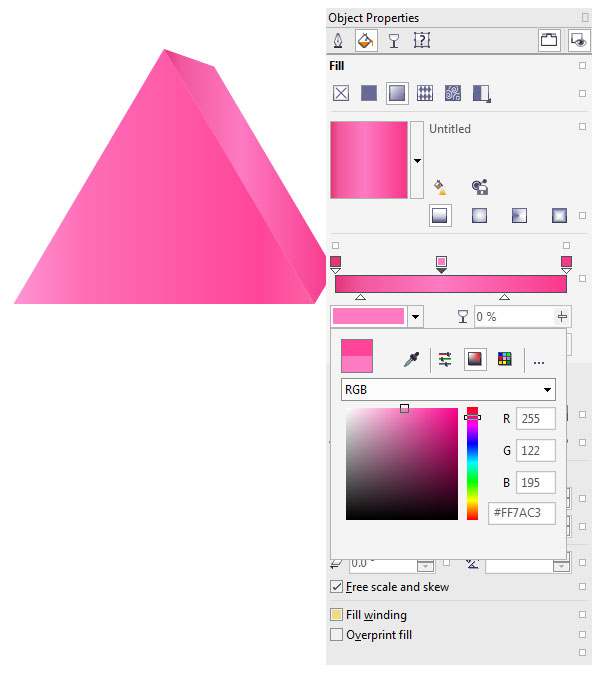
Step 3
Select each component of your 3D shape and in the
Object Properties docker you can apply more complex gradients and other properties. For additional fun with gradients in CorelDRAW, check out
How to Create and Use Gradients in CorelDRAW.
Make sure your object components are
Grouped (Control-G) together before you continue on to the next letter.
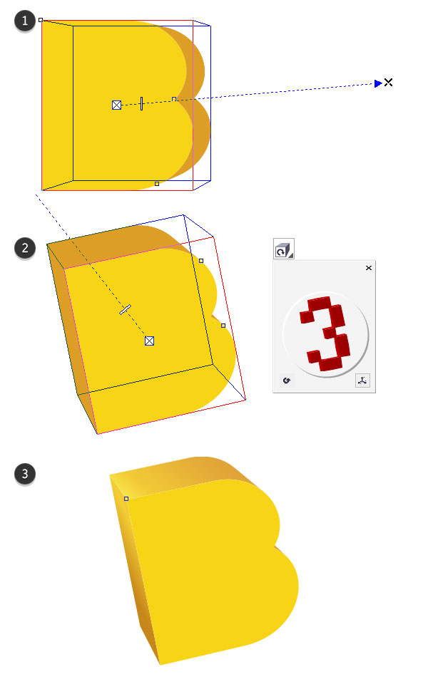
3. Rendering the Other LettersStep 1Let's move on to the letter "B"! I've decided to start with the
Extrude Tool, using the same method as for the triangle, and then alter the shape for an additional twist.
1 Drag out your object's 3D plane with the
Extrude Tool.
2 In the
Property Bar, hit the
Extrude Rotation option. Rotate the red number 3 in the option box in order to change your 3D object's angle.
3 Set your extruded object's color properties either in the
Extrusion Color options or in the
Objects Properties docker after having hit
Break Extrude Group Apart.
Step 2Finally, we've got our Pac-Man-esque letter "C".
1 Choose your letter and color for the final object (in the event you'd rather not create the same final image as the one in this tutorial).
2 Use the
Extrude Tool to drag out the object's backside to the lower right.
3 Hit
Break Extrude Group Apart and after setting the
Fountain Fill colors in the
Object Properties docker, use the
Interactive Fill Tool (G) to adjust the gradient's angle and placement on each of the object's components.
4. Applying Quick Drop Shadows to ObjectsStep 1I briefly introduced the
Drop Shadow Tool in the tutorial
How to Create and Use Perfect Shapes in CorelDRAW. Let's take another look at this tool's versatility.
Select the "A" group and use the
Drop Shadow Tool to drag out and place a drop shadow behind the object. Adjust the
Shadow Feathering,
Drop Shadow Opacity, and other options in the
Property Bar.
Step 2When satisfied with the drop shadow applied to the "A" group, hit the plus sign in the
Properties Bar next to the
Presets drop-down menu. This will allow you to save and reuse the drop shadow on other objects.
Once your shadow preset has been saved, select the other objects in turn and select your shadow from the
Presets drop-down menu. The same angle, strength, and properties of the first drop shadow will be automatically applied to your other objects.
Great Job, You're Done!
See the image below for how far our simple little flat shapes have come in this quick tutorial. Share your results in the comment section below. Apply such extrusion effects and rendering techniques to an entire alphabet of letters, or create a whole poster design filled with three-dimensional text.
Source tutsplus.com